When you have young children, you may feel lost when it comes to figuring out how to combine functional living with your aesthetic.
Designer Laura Umansky shared with Carpet One how one of her clients struggled with this concept and how she bridged the gap between high-end luxury and practical living.
This family had a new construction home in the West University area of Houston, near the heart of the city. The couple loved bold hues and had an impressive art collection to match. They also had four children under the age of four. The goal was to create a home that honored what they loved, while also capturing the stylishness they desired.
This was the clients’ wish list:
- Embrace jewel tones.
- Include heirloom furniture and artwork
- Use high-performing fabrics and softened edges for the children.
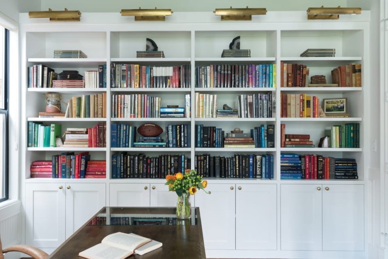
- Create a custom-built display for their rare book collection.
And of course, it was crucial to work with their existing art.
Choosing the Right Paint Color

Start with a flat finish. Depending on the artwork, you can work with white, gray, or even light green. What we are trying to achieve is contrast. Over the years we have developed a list of our favorite paint colors that help art pop:
- Dovetail by Sherwin Williams: A classic gray that works as a foil against lighter and softer artwork, like a charcoal drawing on paper
- Alabaster by Sherwin Williams: A serene off-white that works well against moodier paintings
- Simply White by Benjamin Moore: A white with a bit of yellow that works well with warmer-toned interiors
- Great White by Farrow & Ball: A cooler white that works well in blue or greenish spaces
Layering Textures and Shapes

The shape of the entry chair mimics the curve of the staircase in a highly complementary manner. This is intentional. Because the art collection was so varied, we created cohesion through texture and shape. We also sourced new art that would happily marry older styles to new ones.
To make sure the home seemed interconnected, we consulted with the clients’ art advisor, Katherine Bowdoin Barthelme of Bowdoin Projects. Together, we curated a colorful and balancing selection that tells a unique story in every room of the home.
Walking into the living room, you will find organic curves next to orthogonal lines. Too many right angles would have been harsh, so we softened the room with arched chairs and spherical objets d’art. The green chairs are vintage heirlooms from the client’s grandmother that we reupholstered in emerald fabric. The result is vibrant, playing off the jungle-like palette of the art piece above the sectional.
When colors, patterns, and shapes come in pairs, the eye can connect them in a pleasing way. On top of a neutral palette, like gray and cream, the pop of green activates the space. There is a tension between some colors that I find really exciting.
Working With The Home’s Architecture and Energy

While art drove the color palette and played an integral role in the design, we also looked to the architecture of the home. Whenever we approach a project, we take the framework as an inspiration. The home was full of character-building details: wainscoting, exposed wood beams, and custom millwork. We felt a distinct mid-century energy that we layered with vintage finds and present-day touches.
Mid-century designs are marked by a familiar orange and turquoise color scheme. We opted for a richer take with jewel tones, like emerald and sapphire, and added rust. Earthy terracotta and cream shades subdued the brighter ones.
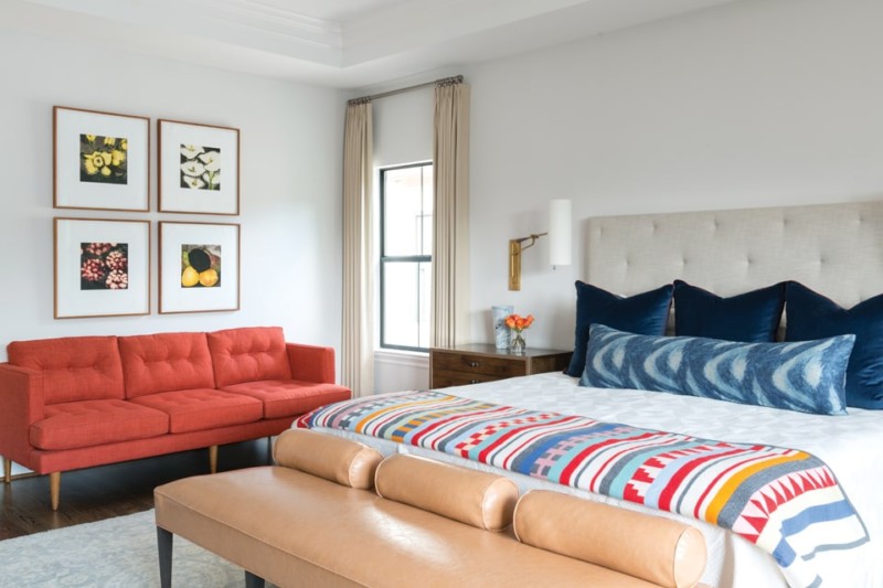
In the master bedroom, we used a more modern and playful take on color. It’s a bit brighter in this room. The red, white, and blue harks back to a classic Americana look that is sophisticated and not kitschy. The gold-finished étagère hosts a collection of poppy colors, family photos, and, again, a clever use of texture and shape. The artwork in this room—four panels featuring flowers—honors the homeowners’ four children.
Opposite this wall are a mid-century desk and chair. The simplicity of the furniture design reflects the architecture of the home in general and gently draws the eye toward the painting above.
——————————————————————————————————
This article is brought to you by McCall’s Carpet One.
 McCall’s Carpet One is Franklin’s locally-owned carpet, flooring & tile center with free estimates and local installation of carpet, hardwood flooring, kitchen and bath tile – plus furniture and appliances by DT McCall’s in the back! Everything home, all in one place – all at great, low prices!
Visit McCall’s low-budget showroom  on Franklin Rd next to The Factory in Franklin, or click for a free in-home estimate.
Please join our FREE Newsletter


