
As you arrive at O’More College of Design in downtown Franklin, you will notice a new sign. Initially, the new signage looks like a brightly colored letter “D,” but if you look closer, it’s more than that. Building upon the idea that O’More College of Design, is about more than fashion but about the whole process of design, they took a hard look at their logo. We sat down with the team of Amy Shelton, Vice President and Director of Development and Marketing; Jess Smith, Department Chair School of Graphic Design, and Doug Regen, Professor of Practice in Graphic Design to learn more about the new logo and what the process was like to make the change.
O’More changed their logo just over a year ago, so what prompted the change to the new one?
Amy: We just went through a rebranding process two years ago, and that’s when the green, black and apostrophe “O” came about and then when Dr. Rosen got here, he was like “what’s up with the brand?” I told him it was only a year old and he was like “that’s terrible.” He knew it didn’t fit at the college, it didn’t fit our purpose.
It was a year’s undertaking. It was the big, missing gap and that’s when he brought Doug and Jess into the process to help us implement it and really make it fit what O’more is about. The last logo was fine, but it had no explanation as to what it is that we do.
Jess: Dr. Rosen came up with an idea and showed it to Doug and I, we weren’t crazy about it, but worked with it and kind of saw what he was going for, and that had to do with the O and the C and sort of the D connecting. That was our starting point, but I’m not sure how the color scheme came about.
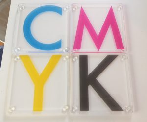
Doug: It just came through the process, we started thinking about similar things in design, something in CMYK. In printing, everything is CMYK (Cyan, Magenta, Yellow and Black) so that was the basis for all the colors. It worked out that we have three programs and each program is branded by a color, then black holds it all together. So you’ll notice all the colors are specific in the buildings, so cyan is for graphics, magenta is for fashion and yellow is for interior. So the business cards are different for each school. The academic department is black. Even with this year’s catalog, we’ve made it more visual and incorporated the new logo and colors.
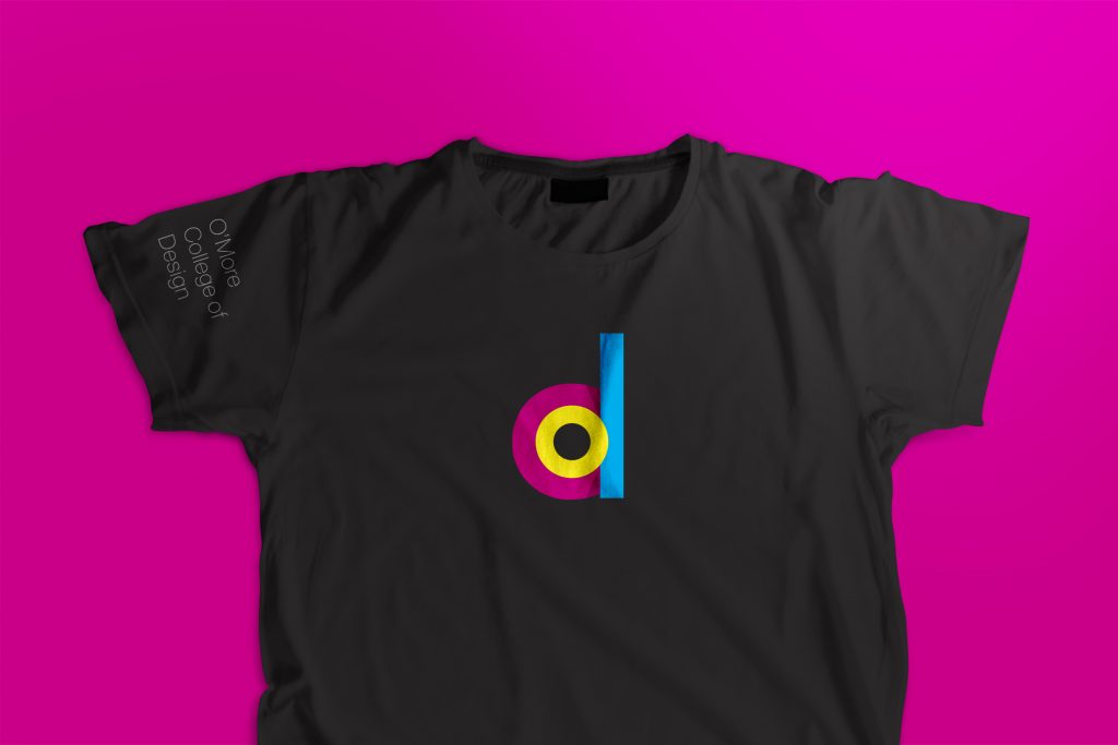
Jess: What I love about being at a design school is that everything has color and this color is so meaningful. They really have purpose. The mark came from playing with my three year old one day, I was coloring and playing with the O and it just really started coming together, it’s a soft mark, it’s appealing.
Yellow is the O
Magenta is C
The D is the most intentional because all we really do here is design.

What was the student’s reaction to the change?
We printed t-shirts, hats and cups to give away. The students loved the hats. There’s no verbiage, just the D, so I think it’s really cool for them and speaks to the design. It’s something to kind of rally around this mark that identifies them.
Students haven’t had anything but positive things to say. And when they returned to school, that’s the first thing that they noticed as they arrived onto the campus. So it’s always fun having something to symbolize that we’re a whole new thing.
Tell us about the community’s response to the change?
Amy: Robert Hicks said to me “I love all things old” but as he drove on campus and saw those signs he said that the signs spoke to him. That’s Robert Hicks though, he loves history, and he was really taken back by the colors. He said “I don’t even like magenta, it’s my least favorite color but I love that sign.”
Doug: I’ve heard a lot of people say “Why are y’all putting poles and banners up?” The banners have been up for years but they never noticed the old ones.
We’ve always had that green, probably for the last 30 years, some sort of shade of that green, and I can never say why but I think it’s because we thought we had a little bit of an Irish past. We’ve lightened it up. It’s been fun, we just did away with the green. We have a rich history.
Jess: We’re still the same school, just growing and getting better. We remember our roots for sure.
It’s cool to get responses from designers in the area saying “what a cool logo” and other designers are liking it as well.
Did you roll out the logo slowly or was it a “all-in” type of thing?
We selected one day and said alright, this is the logo for your email and had everyone change it. That day, I had floods of emails from people saying “Oh my God that’s so cool!” That week we sent it to our PR firm, and they immediately started using that, so it just kind of slowly trickled about. We redo and update our catalog and view book every year. This one was just a little more intense because it required a lot more changes with the new logo.
We did a brand guide early on in the summer which talked about how to use the mark, the colors, the new font. We distributed that first and got the outward things done before the students came in.
What do you think Mrs. O’More would say about the new logo?
Jess: I think it points more than anything to design, and that’s what we need, and so the color choice is all speaking back to the design. That doesn’t change our roots, there’s still an O.
Amy: I think Mrs. O’More would love the brand, she had such a love for color, she always had color all over her walls, her furniture, her clothes, she would say “well done.”
Doug: She was a trend setter, always looking forward. She would love this.


