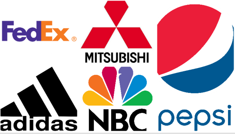
A company’s logo is not only an artistic way for a company to brand itself; it is also an opportunity for a company to create a symbol that will motivate people to care about that company and buy their products, click on their website, spend money, etc…Therefore, many notable companies credit their success to their logos. Although you’ve seen these logos hundreds of times, you may not know all the intricacies that went into designing them. Here are 5 logos that mean way more than you might have imagined.
1.FedEx
At first glance, the FedEx logo may just look like the company’s name, but its the company’s use of white space that makes their logo so unique.
In the FedEx logo, the “e” and “x” are positioned in such a way that an arrow is formed in the space between them, subliminally telling customers they are fast. “Many people don’t specifically notice the arrow but still process it on an unconscious level, associating it with the sense of speed and proficiency,” writes Scott Hillard. We’ve placed a black box around the arrow below:
2. NBC Logo
We all know the NBC logo is a peacock, but do you know why NBC chose a peacock for their logo?
According to Hillard, it was all a ploy to get people to buy color televisions. “At the time of the logo’s development, NBC was owned by the elecronics company Radio Corporation of America (RCA). Color televisions were just beginning to emerge and RCA wantd a way to show the public that the relatively high price of the units was worth the enhanced experience of viewing in color.”
3. Pepsi
Pepsi’s original logo: a circle with red, blue and a white line was supposed to represent the American flag. When Pepsi wanted to revamp the logo, they spent hundreds of millions of dollars and the agency hired to create their current logo presented a 27-page document explaining the many intricacies of the logo. “According to this document the new logo represents the Earth’s magnetic field, feng shui, Pythagoras, geodynamis, the theory of relativity and more,” writes Hillard. Here’s a look at the evolution of the Pepsi logo.
4. Adidas
If you want to exercise more, you might want to pick up a pair of Adidas. Supposedly, their logo makes you work harder. Adidas shoes became known as the shoes ‘with the three stripes.’ Although the stripes have remained part of the company’s brand, the stripes have been altered slightly. Hillard says, “The current logo features three slanted strips in a triangle shape….this new logo symbolizes a mountain, a metaphor for the challenges and perceivable goals that all athletes must meet and overcome.”
5. Mitsubishi
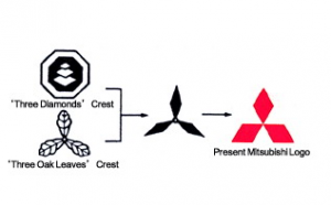
The goal of the Mitsubishi logo was to combine two family crests–the three leaf crest of the Tosa Clan and the Iwasaki family crest, which was three diamonds stacked on top of each other. “The three diamonds are said to signify reliability, integrity and success, and are colored red because red denotes confidence and attracts customers to the brand,” writes Hillard.


